In this article, we'll guide you through the data, metrics and booking trends you can find in TuCalendi Analytics, so that a simple visualization tells you what is happening with your business meetings.
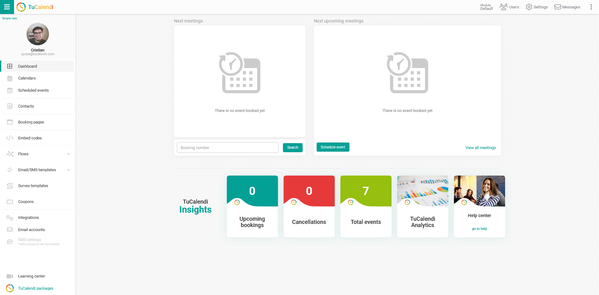
Log in to TuCalendi with your username and password. In the Dashboard, you'll find direct access to TuCalendi Analytics:
NOTE: To access TuCalendi Analytics, you need to subscribe to the Pro Plan.
In the "TuCalendi Insights" section, click on the "TuCalendi Analytics" option.
Let's look at what information is displayed in each block of the TuCalendi Analytics dashboard, how to customize the dashboard and how to set filters.
Trends and created by
- Trends: In the trends graph, the number of bookings is shown with a green line and the number of cancellations with a red line, plotted against the days of the month selected in the filter.
- Created by: Shows where the bookings were made: from the widget embedded in a website, manually from the TuCalendi dashboard, from a booking page, or unknown when the system cannot detect where the booking came from.
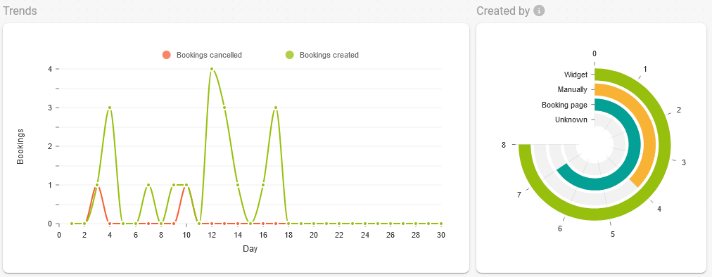
Move your mouse over the graphs to see the numerical value.
Completed bookings and most completed events
- Completed bookings: The graph shows the daily evolution of completed or finished meetings.
- Most completed events: The number of completed meetings for each event in the selected month.
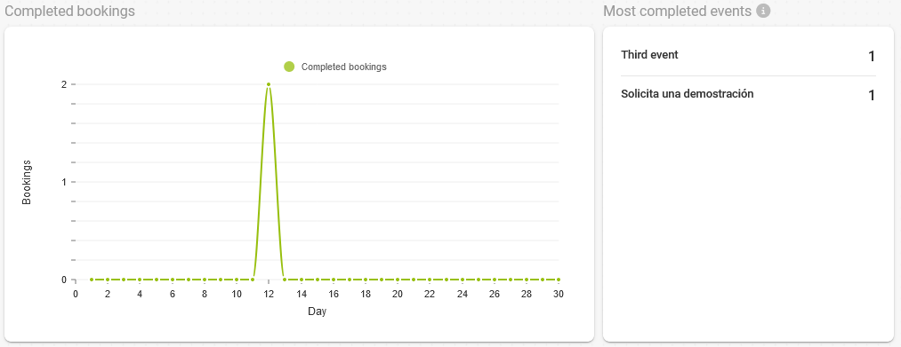
Completed bookings are meetings that have ended and have been completed by you or any member of your team.
Durations and days of the week
- Durations: The time in minutes of the meetings completed each day.
- Days of the week: The most popular days of the week on which meetings are completed. Each vertical bar shows the cumulative number of meetings completed on each day of the week in the selected month.
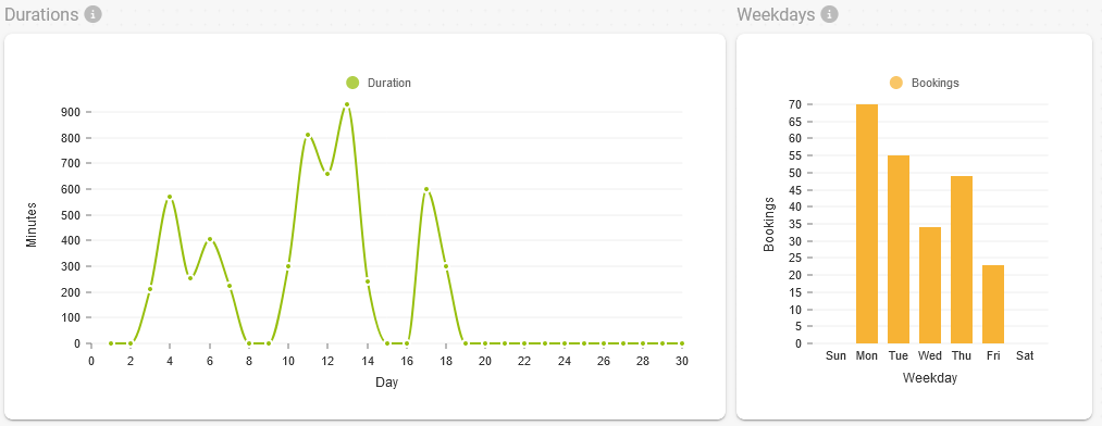
Move your mouse over the graphs to see the numerical value.
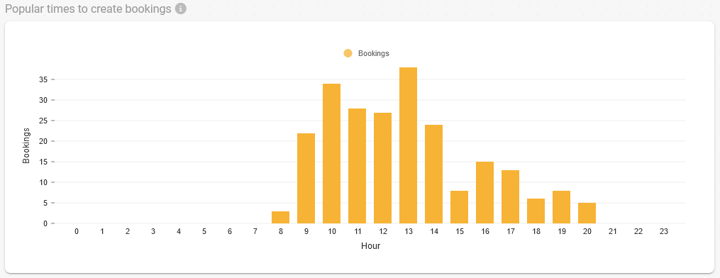
Most popular times for bookings received
- Most popular times to create bookings: Shows the times of day when you receive the most bookings, both those made manually and those made by customers through the widget or booking pages. Each vertical bar shows the monthly cumulative total for the corresponding hour.
Revenue
- Revenue: If you have events where you receive payments, this graph shows the amount charged to your customers each day when they book with you. It also shows the total amount collected in the selected month.
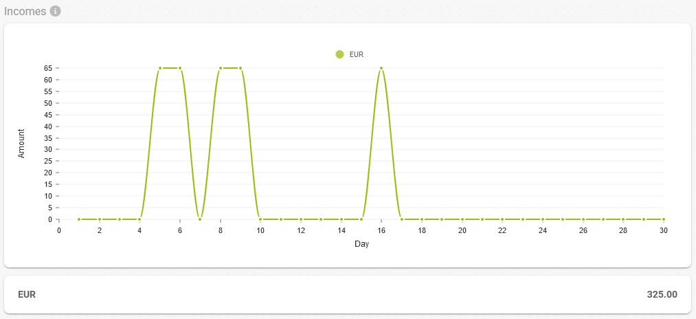
If you charge in different currencies, the graph shows each currency in a different color and the total shows the accumulated amount in each currency.
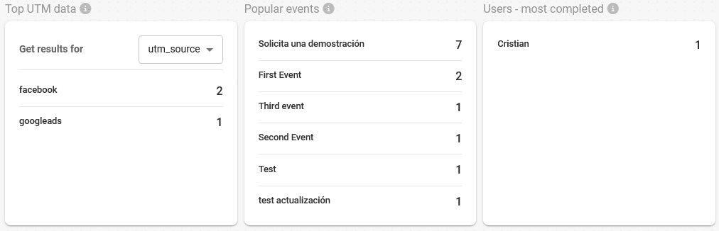
Relevant metrics
- Top UTM data: If you add UTM parameters to the widget URL, you can see the number of bookings received for each UTM parameter used.
- Popular events: The most booked events in the selected month and the number of bookings received.
- Most completed users: The users who have completed the most meetings, along with the number of meetings each has completed.
Customization
With the "Customize" option, you can enable or disable blocks so that only the information that matters to you is shown.
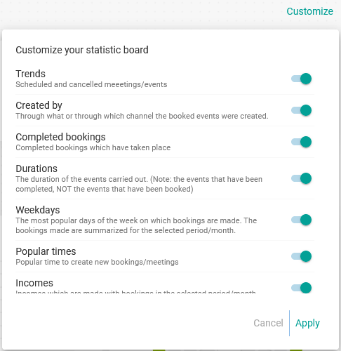
For example, if you don't have events where you receive payments, you can deactivate the "Income" option so that the boxes with the graph and the total collected are not shown.
Filters
Using the options under "Filters", you can set a "Filter by time period" to choose the month you want to analyze and the month you want to compare it with:
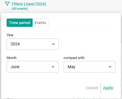
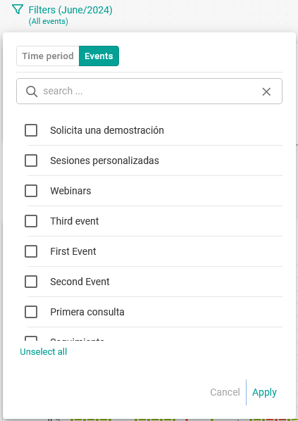
You can also set the "Filter by events" by selecting the events you want to include in the statistics: