How to Configure the Widget's Border Style
We'll explain how to configure the border style of the TuCalendi widget using a theme template. The border defines the widget's visual outline and allows you to adapt it to the design of the page where it's embedded.
The border settings are divided into two sections within the editor: Widget Border Style, which includes width, style, and color; and Border Radius, which controls the rounding of the corners.
- Width: The thickness of the widget’s border, expressed in pixels (px).
- Style: Border line type: solid, dotted, dashed, among others.
- Color: The color of the widget’s border.
- Radius: The rounding of the widget’s corners, expressed in pixels (px).
Clicking on each of these fields opens a menu with the available options to select the desired value.
Before You Begin
To follow this tutorial, you must go to the "Widget Appearance" section and have an appearance template created to edit. The complete process of creating and assigning templates is explained in the general tutorial on how to create and assign a widget appearance template.
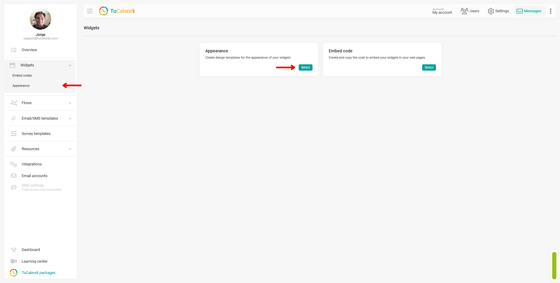
Step 1. Access the widget’s appearance
From the TuCalendi side menu, go to the "Widgets" section and select the "Appearance" option.
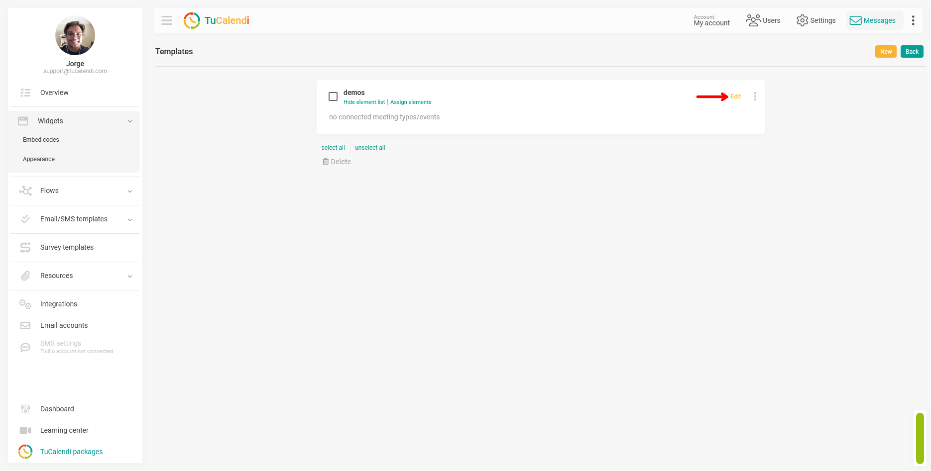
Step 2. Create or edit a widget appearance template
Within the "Appearance" section, create a new template or edit an existing one by clicking "Edit".
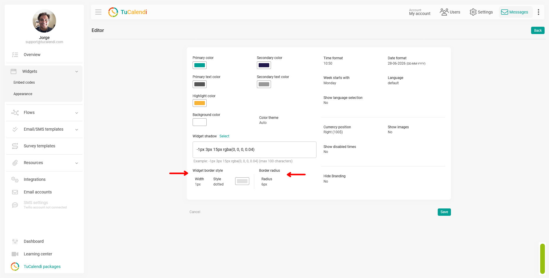
Step 3. Locate the border fields in the editor
In the template editor, locate the border fields at the bottom of the customization panel. You’ll find two distinct sections:
- Widget border style: includes the Width field, the Style field, and the border color selector.
- Border Radius: contains the Radius field, which controls the rounding of the widget’s corners.
The following screenshot shows the location of both blocks within the editor, marked with arrows.
Step 4. Configure the border style
Click each field to open the options menu and select the desired value:
- Width: Select the border thickness in pixels. A value of 0px removes the border completely.
- Style: Choose the border line type from the available options, such as solid, dotted, or dashed.
- Color: Select the color of the widget’s border.
Step 5. Configure the border radius
In the Border Radius block, click the "Radius" field and select the desired value in pixels. A higher value produces rounder corners, while a value of 0px gives the widget straight corners.
Step 6. Save the changes
After configuring all the border settings, click "Save" to apply the changes to the theme template.
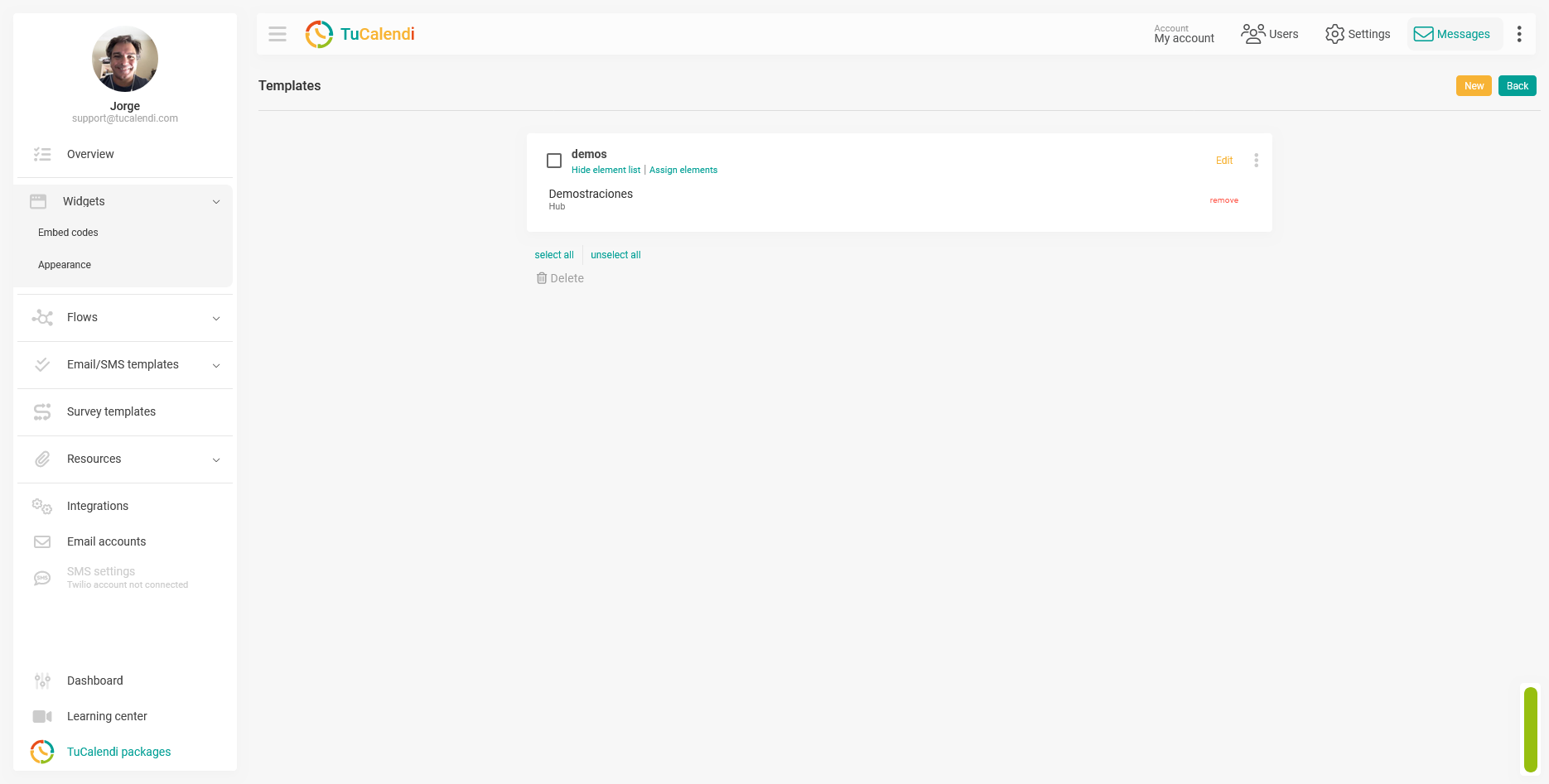
Step 7. Check the element assignment
Once the template is saved, verify that it is assigned to the corresponding hub or survey with routing. If the template is not assigned to any element, the changes will not be reflected in any widgets.
Short version for the Help Center
To configure the widget border, go to "Widget Appearance" create or edit a template, and locate the "Widget Border Style" and "Border Radius" fields at the bottom of the editor. Click each field to open the options menu and adjust the width, style, color, and border radius according to your preferences. Click "Save" and verify that the template is assigned to the corresponding hub or survey.