How to Customize the Colors of the TuCalendi Widget
This tutorial explains how to customize the colors of the TuCalendi widget using a theme template. The colors determine the widget’s visual identity and allow you to adapt it to each business’s brand image.
When you create a new theme template, all color fields are automatically populated with default settings. From there, you can modify each color individually to achieve the desired look.
The widget has six individual color fields and an additional field for the overall theme:
- Primary color. The main color of the interface: buttons, days, and highlighted elements.
- Secondary color. Accent color for secondary elements.
- Main text color.
- Secondary text color.
- Highlight color. Used to highlight elements within the widget.
- Background color
- Color theme. General visual mode: Auto, Light, or Dark.
Before You Begin
To follow this tutorial, you must navigate to the widget’s Appearance section and have a theme template created that you can edit. The complete process for creating and assigning templates is explained in the general tutorial on how to create and assign a widget theme template.
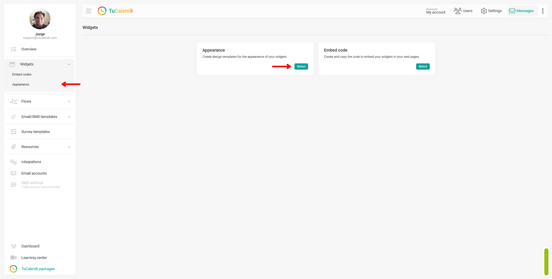
Step 1. Access the widget’s appearance settings
From the TuCalendi side menu, go to the "Widgets" section and select the "Appearance" option.
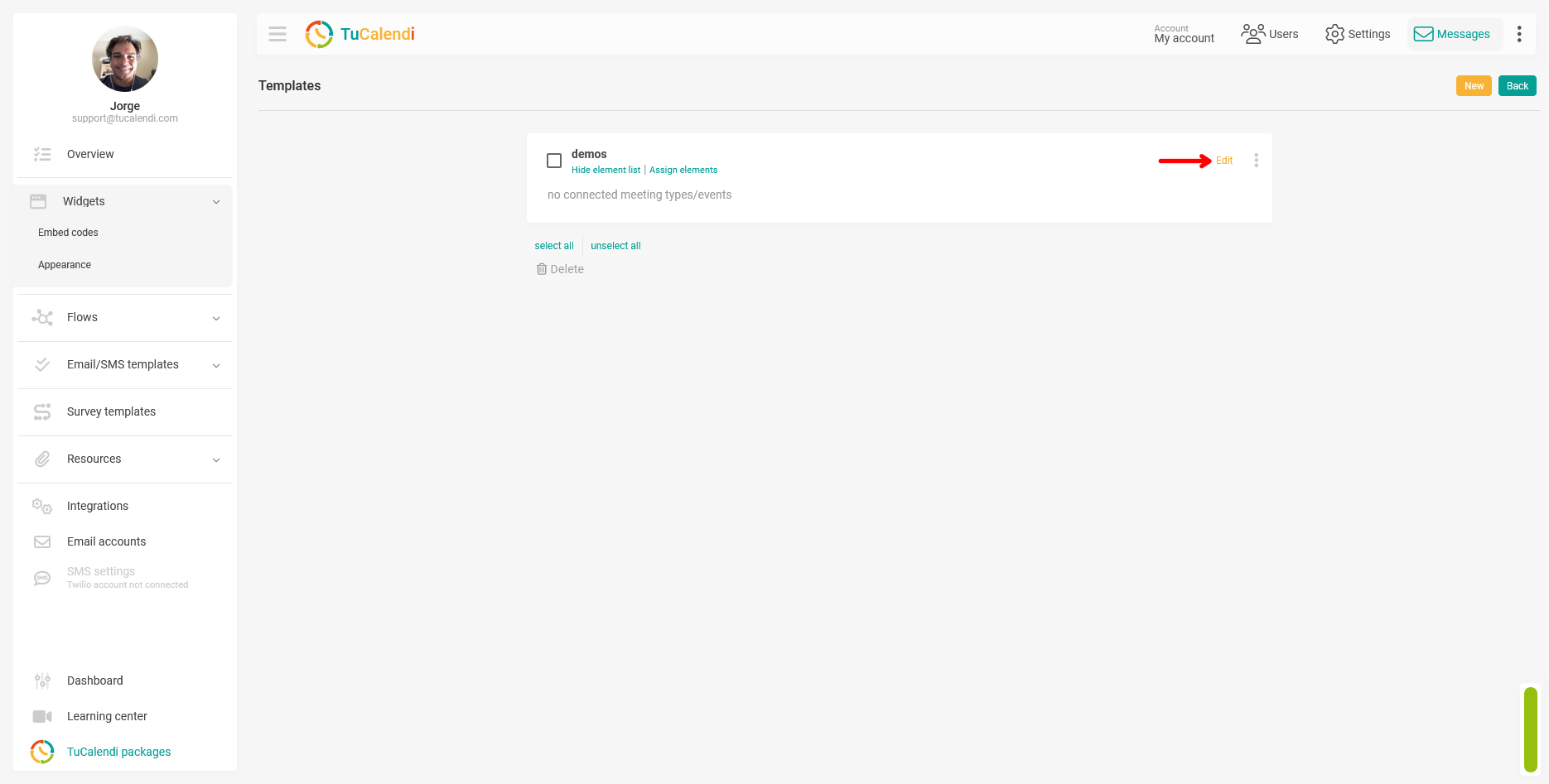
Step 2. Create or edit a widget appearance template
Within the "Appearance" section, create a new template or edit an existing one by clicking "Edit".
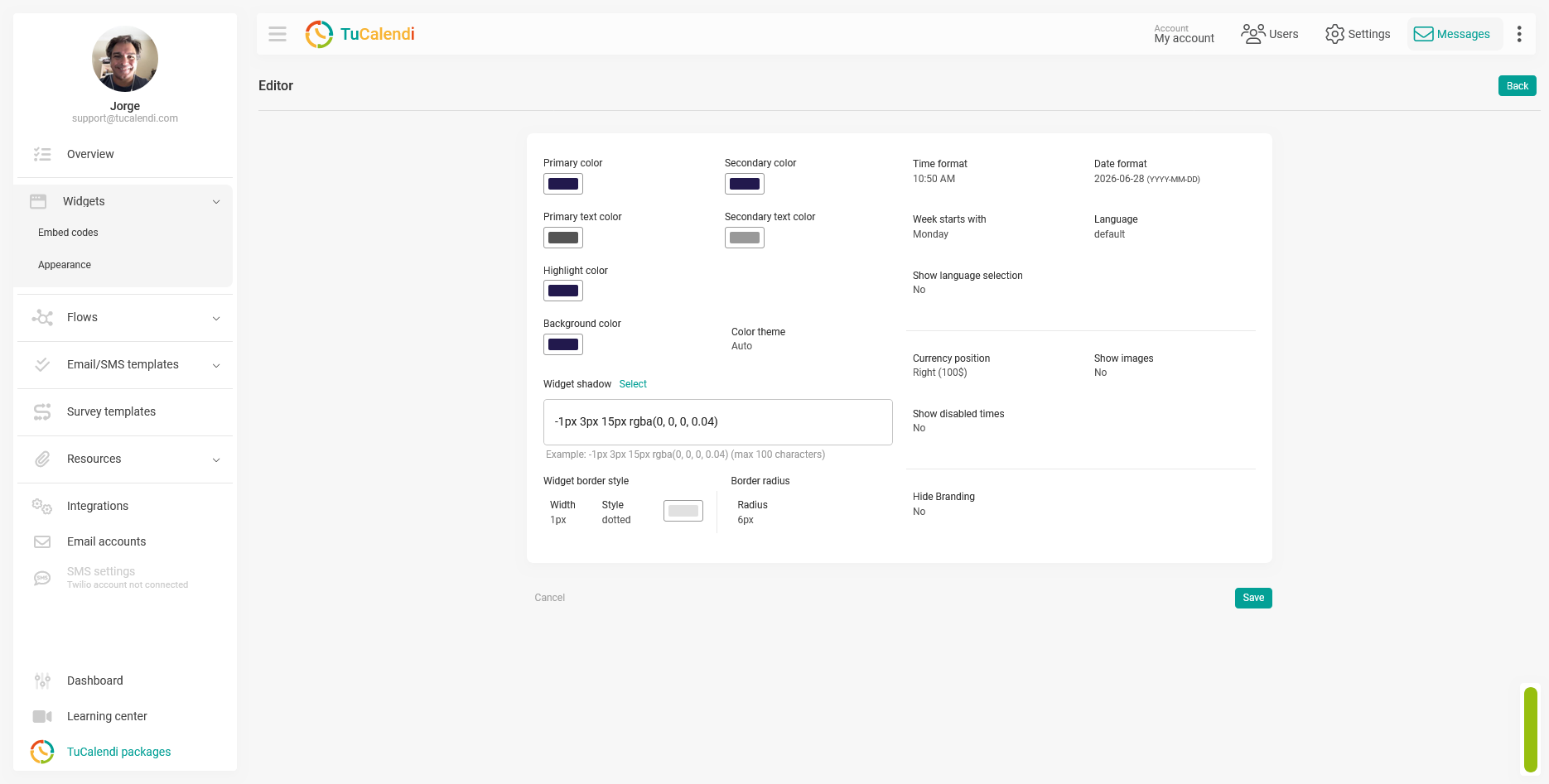
Step 3. Review the default color settings
When you create a new template, all color fields are automatically filled with default values. The screenshot below shows what the editor looks like with the default color settings.
Step 4. Customize the template colors
Click any of the color fields to open it and select the desired value. You can modify each field independently:
- Primary color: affects the main buttons, selected days on the calendar, and the most prominent elements of the interface.
- Secondary color: Applies to supporting elements of the interface.
- Main text color: controls the color of the main text visible in the widget.
- Secondary text color: controls the color of secondary text, such as descriptions and labels.
- Highlight color: used to highlight special elements, such as notifications or important actions.
- Background color: Defines the widget’s background color.
- Color theme: allows you to choose between Auto (the widget adapts its appearance to the user’s system’s light or dark mode), Light (always in light mode), or Dark (always in dark mode).
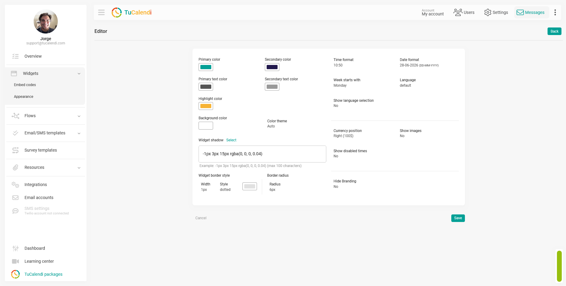
The following screenshot shows the editor with TuCalendi’s colors applied as an example of customization.
Step 5. Save the changes
After configuring all the desired colors, click "Save" to apply the changes to the theme template.
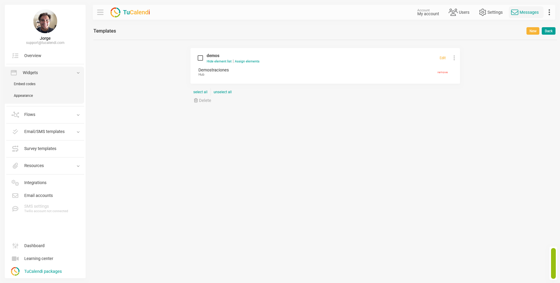
Step 6. Check the element assignment
Once the template is saved, verify that it is assigned to the corresponding hub or survey with routing. If the template is not assigned to any element, the changes will not be reflected in any widget.
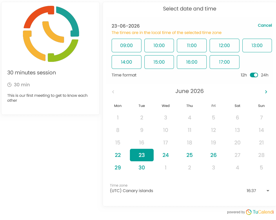
Step 7. Check the result in the widget
Once the colors are configured and the changes are saved, the widget will display the new color palette on all its screens. The following screenshot shows how the color customization appears in the widget visible to the end user.
Process Summary
To customize the widget’s colors, go to "Widget Appearance" create or edit a template, and modify the available color fields: Primary Color, Secondary Color, Main Text Color, Secondary Text Color, Highlight Color, Background Color, and Color Theme. When creating a new template, all fields are populated with default values that you can freely modify. Click "Save" verify that the template is assigned to the corresponding hub or survey, and check how the widget appears after the colors have been customized.